SEMIOTICS:
Semiotics, also called Semiology, the study of signs and sign-using behaviour. It was defined by one of its founders, the Swiss linguist Ferdinand de Saussure, as the study of “the life of signs within society.” Semiotics is the study of sign systems. It explores how words and other signs make meaning. In semiotics, a sign is anything that stands in for something other than itself. This lesson focuses primarily on linguistic signs. A sign is anything that can convey a message.
GESTALTS THEORIES:
https://study.com/academy/lesson/what-is-semiotics-definition-examples.html
COLOUR PSYCHOLOGY:
Colour psychology is widely used around us and in the field of advertising and marketing, as it is the study that deals about colours and how different colours effects the human behaviour. ‘Colours have variety of embedded meanings, which can be linked to different emotions and moods.’ For example, Red colour connects to power, aggression, energy and passion. Yellow colour represents motivation, hope, vibrancy and optimism, blue colour represents positivity, trust, security and responsibility, whereas orange colour represents fun, cheerfulness, friendly feels and can be effective to use for children based content, similarly white is used to represent purity, innocence, goodness’ pink represents romance, attention and passion. ‘Colour is a key design element of its ability to illicit emotional reactions in the viewer’. (Ambrose and Harris, 2005)

PSYCHOLOGICAL EFFECTS OF COLOUR:
WARM COLOURS:

Colours are a powerful tool and used to often change or effect the human emotions. It is universally accepted that colours effects emotionally . Bright red, yellow and oranges tend to stimulate humans while blues and greens often makes people relax, fresh and peaceful. Psychological research have found out that the humans associate the colours of fire – red, yellow and orange with warmth because under red light human bodies secrete more adrenaline and increase the blood pressure and rate if breathing and increase the temperature slightly. Hues in the red area of the colour wheel is referred as ”warm” because of the reaction of colour to human mind and body. (Zelanski and Fisher, 1999)
COOL COLOURS:

At the same time where red, yellow and orange colours are referred as warm colours, the blues and greens are referred as ”cool” because of their effects to human minds and bodies. Physiological research shows that green and blues will slow down the heartbeat, decrease the temperature and relax human muscles. (Zelanski and Fisher, 1999) as green and blue colour have the qualities of water and trees. Both of the warm and cool colours effects the human mind and body in an opposite way as warm colours increase the blood pressure and temperature of the body and thats why they are called warm, at the same time cool colours slow down the heartbeats and temperature and makes us feel relax and more peaceful.
EXPRESSIVE TYPOGRAPHY:
Expressive typography is a form of art in which the typography looks stronger visually and creates a from of image in the mind of the audience of the certain word. Typography is one of the unique way to visually engage the audience to the message behind the typography.


The examples I have used are called Expressive typography as both of the words are showing the visual presentation of the words which is scissor and vibrate, the words are completely demonstrating the meaning and image through the use of expressive typography.
SHAPE THEORY:
Shape could be defined as an outline or area different from its surroundings, as shape is one of the seventh element of art. shape can be an outline or could be shaded in.
There are two basic types of shapes,
- Geometric shapes ( can be defined as more rigid and fixed shapes presenting something clear like roads, blocks, skyscrapers etc.
- Organic shapes ( could be defined as nature based shapes by the natural environment.
DESIGN CYCLE:
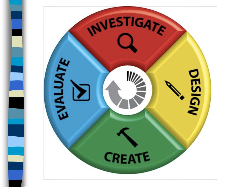
Design cycle. (2019). [Image]. Retrieved from https://images.slideplayer.com/24/7236708/slides/slide_4.jpg
The design cycle is a series of tools used by designers to help them create and evaluate solutions in response to design problems. The cycle can have many sections, but in its simplest form it is investigate, plan, design, create & evaluate.
It is compulsory for every designer to follow the design cycle and work step by step as if you have missed any of the step then you will not going to get the best results from the work or project you will be working on.
Investigate: You will need to consider the possibilities and ideas for the problem.
Plan: Write a list of all the stages you think you will need to achieve for a successful project.
Design: Produce lots of different ideas for the project. Include sketches and thoughts. Create: This is where you make your design to the design you created.
Evaluate: You should reflect on what you have done. Ask yourself if the final creation answered all the questions you set you in the investigation section.
https://www.schoolsofkingedwardvi.co.uk/ks2-design-design-criteria-1-design-cycle/
MARK MAKING:
Mark making is a process used to create shapes, patterns, lines and textures. It is not only helpful for kids to learn but a great art process to be use by people of all ages. Mark making could be done by only using pencil on a paper or a brush, on ground and moving the objects in different ways. It is a also beneficial for the students to gain confidence by experimenting with different art materials.

IMPORTANCE OF MARK MAKING:
- Mark making is crucial for the development and learning of a child. It not only teaches young children how to hold a pen correctly, but it also prepares them for writing and develops their handwriting skills.
- Mark making is a great way to explore creativity inside you.
book covers:

The above book cover gives a strong visual look to the cover because the way expressive typography is used rather than using fonts, the designer tried to interpret the words with the real imaginary of the words such as the word love has been created using the flower petals, ‘pray’ using ‘tasbeeh’ and word ‘eat’ by using spaghetti.

The typography used for the above book cover design is using bold font and I really like the way, the typography has been laid out. The limitation of colour palette is one another factor making the typography look visually strong and appealing to the eye.

ANALYSIS:
The book cover design above, the designer has used the expressive typography that is making the audience to feel exact the same as the name of the story that is the great way to fall, the word ‘fall’ is a expressive type word making the audience to feel the meaning of falling from the height to the ground.

ANALYSIS:
The typography used in the above book cover is quite interesting and gives the cover really minimal look because there is a lot of empty space which can be seen and also the colour palette used is black and shades of black. Capital letters have been used to make the typography stand out as there is only typography used to make the audience see the imagery visually at the same time.

The above design is showing all different sizes and how the spacing have been used in between the letters. The chalk/charcoal used to give the hand made effect to the audience.

ANALYSIS:
The typography used in the above book cover looks really interesting and colourful, the typography have been used in such an interesting way the way A and Z alphabets are more prominent when you first look at the cover but when you see in more detail you can acutally see the words in the background and also connected to the main alphabets which looks cool.

ANALYSIS:
I really like the design of the above book cover created by using mark making technique and I think the way fingerprint texture used looks amazing and simple because there is limited colour palette used and you can also see the same textures in the typography at the bottom.

ANALYSIS:
- Love how the limited colours used making the design look simple and eye catching.
- Mark making technique used to give the book visual image but I really like the way less amount of materials and colours can exactly make the audience feel and understand the same imagery as compared to well designed image and colours.

ANALYSIS:
- The mark making technique used by using the different people’s finger lines texture using black paint/ ink.
- The brown background colour used makes the textures and lines more prominent and eye catching.
- I really like the way the typography is written in the bottom left of the book cover making it look unique in real as well and actually connecting the name to how the designer designed the cover to make the people feel the design unique.
ANALYSIS:
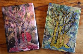
- The different colours used making the covers look interesting and standout.
- There are a lot of different styles of mark making has been used by using different materials but everything have been made using textures and marks used in unique ways to create the trees and there are two different colour palette used for each image but the techniques and imagery used is the same.

ANALYSIS:
- This is the one of my favourite example of mark making which is just rough lines used and drawn and been scribbled around.
- I can actually see a face in the middle of the lines making it a face of someone and I was really amazed the way how only rough lines can make such a nice art piece.
- The context behind this mark making art piece can be seen after giving the image close look which I think is amazing how a hidden face can be seen in rough and scribbled lines.
MARK MAKING IN SESSION:
In the last week session with Kathryn, we were asked to create mark making by using the words ‘calm’ and ‘angry’ in words or just anything that come up to mind by using the mark making technique.
CALM EMOTION:
I am created a series of written word expressing feeling of ‘calm’ by using mark making techniques to show and express meaning of calm word by using ink and graphite colours and other objects and materials.


ANGRY EMOTION:


EVALUATION:
- I feel that by experimenting this technique of mark making, I have understood how can we still can make people feel certain feeling by using words in expressive ways and I found mark making is one of the best ways.
- It was also a great practice to experiment a new technique although I have done some mark making in printing area in the first year but this was something different and new for me to learn and work on.
- By using mark making technique, I have explored a lot of great and unique textures that I can use for my future projects.
- I would definitely use this technique of mark making to get brilliant textures and designs and to get better in creating work using physical objects and materials to use them digitally in future.
BOOK COVER: ANGER

ANALYSIS:
- I feel that by using thick black borders around the cover and using the mark making effect that I created in the last session makes the marks looks being alone and gives that anger feel to it.
- I have played with the colours of the anger marks to make it vibrant but dark at the same time by increasing the brightness and decreasing the levels from certain points to make the ends of the marks rough and sharp.

EVALAUTION:
- I have used my own created mark making work to experiment creating a book cover using the textures only.
- I feel the cover above is conveying the feel of anger by the use of the mark making texture that I used in the center of the page.
- I have create borders in a unique way by leaving a gap between the lines and used the same textures by using clipping mask behind the border layer.
- I feel the limitation of colours is also a major point to make the cover look rough and sad because of the use of black colour.

- I feel that I have used a uique layout style of presenting the feel of anger in a book cover by leaving more blank space and elimination of colour palette.
- I would say that by using the mark making textures bigger in the background only makes the audience feel blood, anger and rage.
BOOK COVER: CALM


I feel the colours that I have used give the feeling of calmness because colour psychology plays a an important role in making people feel what you want them to feel by using the right colours.
CREATING WORDS “ANGERY” AND “CALM” IN 3D USING LASER CUTTER:
- In this session with Kathryn, we were introduced to, how to use laser cutter and create 3d typography.
- We have used a software called APS-ETHOS to write the words using different fonts and cutting styles.
- I have used different fonts for each word according to the feel of that word.
- I have used soft, smooth and comfortable to eyes fonts for the word “calm”.
- Used quite harsh, itchy and rough looking fonts for the word “angry”.
- After writing the words using various fonts, we were introduced to the rules and safety procedure to how to use laser cutter.
- I quite like the result after using laser cutter as it acutally cut the words in exact same style as it was on the computer.

dav 
dav 
cof 
dav 
dav 
dav 
dav 
dav 
dav
CUTTING AND CREATING ALPHABET A USING ALUMINIUM SILVER SHEET:
We have been introduced how to cut the aluminum using the cutter and how to join different pieces of the alphabets using different tools and attaching the pieces by creating wholes at the joining points and adding small nuts to the wholes.

dav 
dav 
dav


CREATING MARK MAKING ON ALUMINIUM:
We were also been introduced to how we can add and create mark making using aluminium sheet by using different tools and materials to create wonderful and amazing textures.

dav 
dav 
sdr 
dav
EVALUATION:
- I would that using laser cutter was a great experience at first and I was not aware that we can still create amazing 3d typography physically.
- It would be really beneficial in future for our 3d projects and other projects to print and create 3d typography.
- I would love to experiment and work more using laser cutter for creating 3d typography and designs.
- Other than that, we were introduced to how to cut and create words using metals and mark making textures on metal/aluminium.
- I would say all the skills will be helping me in future at some point and I would like to work more on creating 3d work rather than just working digitally.
3D TYPOGRAPHY:

ANALYSIS:
- The 3d typography poster is using rules of thirds as the main subject, in this poster is the typography which is straight in the center of the page/poster.
- The poster is although in the form of an image but it has got an element of movement and motion in it which that can be easily seen the way the typography has been laid out in a smooth wavy road which is connecting the viewers attention to a movement or a motion happening in the typography present.

ANALYSIS:
- In the 3d typography above. I would argue that there is an element of movement and motion happening, the way the tongues have been laid out and moving to different places.
- I really like the way, the word bog mouth has been presented by using tongues which directly grabs the viewers attention to the typography ans the way, tongues have been used as an object in the form of typography.

ANALYSIS:
- I would say that the 3d typography above about a fresh orange juice, the elements of colour, shape and texture have been used to make the typography look more real and connected to the subject.
- I really like how the colours been used automatically making the viewers mind think of an orange and the way, each word has been created, making each word look more real as if there is a real orange has been used to create each word of the typography.
- The element of texture is used to add more depth to the 3d typography and make it look realistic and stand out.

ANALYSIS:
- In the above example of 3d typography, I would say that elements of scale, composition, repetition, texture and depth have been used which can be seen at first glance at the image.
- The use of rope is used as a main object to create the typography and also to connect the object and the typography to each other.
- I really love the factor that how by using an object, you can actually feel the same object that comes to your mind when you read the typography and then the object is actually present and used as an main object to create that word.
3D TYPOGRAPHY:


I have used aluminium wire to create the words, ANGRY because the silver wires gives the feel of cage and cruelty. I have twisted the wire from different areas to make the word look shape and rough at the same time.


I have experimented creating 3d typography of the word, ANGRY by using the toothpicks by breaking and torn them from different areas to create the word angry. I would say that the shape ends on the toothpicks and torn parts makes the words convey the feel of anger and revenge.
CERAMICS SESSION:
- We had one session in Ceramics to experiment and explore how we can create 3d effects typography using different types of clay and materials.
- We were given a tutorial by Jacky on how to use different clay and what are the differences between different clay.
- I created the same word ANGRY using the white clay and used angry lines around the words.
- To create the words, i have used blocks of words and placed them on the clay and took them out when the words were printed on the clay.
- I feel I have used rough lines and textures to make the word look angry in real and make the viewer feel the same feeling.

dav 
dav 
dav 
dav 
dav 
dav 
dav
3D DIMENSIONAL LETTER:


GROUP TASK:
- In a group of 2, we were asked to create a 3d typography out of any type of clay without being precious and work quickly together.
- Me and Sabrina, chose word ANGRY to work on and used white and red clay together to get a unique marble effect after mixing both of the clay together.
- We used a lot of mixed clay as a background for the typography and write the letter Angry on to the clay that we used as a background to make it look like as the words are popping out of the clay.

cof 
btr 
cof 
cof 
cof
EVALUATION: (CERAMICS SESSION)
- We had one session in Ceramics to explore and experiment creating 3d typography using clay and other materials.
- I would say it was a great experience and learning how we can create 3d words with different types of clay which will put a different effect on the typography.
- I have experimented 3d typography using the same words, Angry and i also created a 3d dimensional typography using the Love, which I quite like, the way I used petals and flowers in the background to give the feeling of happiness and colours using the greenery over the blank white clay.
STARTING SEQUENCE FOR DRAMA:
BRIEF:
- The brief for this module is to design and produce the title sequence for a TV drama called “Alone”.
- The outcome of this project will be video based and must include the use of physical typography.
- The video have to be around 1 minute long.
- There are no restrictions to decide the theme of the video, it can be any theme.
TARGET AUDIENCE:
As there is no specific age group and demographics been given in the official brief which means that we can decide the audience depending on the genre and theme of the title sequence and who we want to target through the video.
TIME MANAGEMENT:
| 12-NOV-19 | Brief launch-contextualise/Analyse research |
| 19-NOV-19 | London trip |
| 26-NOV-19 | Ideas and development |
| 03-DEC-19 | Ideas and development |
| 10-DEC-19 | Storyboard and development |
| 17-DEC-19 | Film- location |
| 07-JAN-19 | Formative assessment |
| 14-JAN-19 | Edit |
| 21-JAN-19 | Final editing |
| 27-JAN-19 | Assessment |
TIME MANAGEMENT EDITED :
| 12-NOV-19 | Brief launch-contextualise/Analyse research UPDATE: Historical Research into film title sequences, word “alone” typography research, writing brief, target audience and time management plan with on-going bibliography. |
| 19-NOV-19 | London trip UPDATE: On the trip to London, I gathered some primary research in the form of photographs of quiet places, weird things and old buildings. |
| 26-NOV-19 | Ideas and development UPDATE: -I started with rough thumbnail ideas for the title sequence Alone.I started with rough thumbnail ideas for the title sequence Alone. |
| 03-DEC-19 | Ideas and development UPDATE: |
| 10-DEC-19 | Storyboard and development UPDATE: Selected 3 best ones and started to create detailed storyboard to explore the ideas in depth considering camera angles, colour, perspective and visual effects. From the selected 3 ideas, I selected the hands moving idea as this idea development did not require out door shooting and depending on people. I also found great potential in this idea as there was more of editing and visual effect work for the development of this idea and I quite like editing and visual effects. |
| 17-DEC-19 | Film- location UPDATE: This week I started experimenting different parts to start developing the idea. I started editing work fro this week using Adobe Premiere Pro. |
| 07-JAN-19 | Formative assessment UPDATE: -Further research into horror intros. -New ideas production using primary images from London research. – Created new version using After Effects and Adobe Premiere pro. -After formative assessment, received helpful suggestions to add the first hand moving version at the end of the video which will then reveal the word Alone. |
| 14-JAN-19 | Edit UPDATE: – I found the suggestion helpful and worked according to the suggestion. -Editing and merged the first video version replacing single hand effect in the end. -Researched and worked on the typography , effect and colour. -Edited sound effects using Adobe Premiere Pro. |
| 21-JAN-19 | Final editing UPDATE: -Received feedback from Will (tutor), he suggested me to use a different effect may be as I was only using one smoke effect and I found the suggestion quite helpful. – Edited and changed some effects to make the video look more suspicious. -Final editing using Adobe Premiere Pro. -Started working on the presentation. |
| 27-JAN-19 | Assessment |
RESEARCH:
TITLE SEQUENCES:
MIMIC (1997):
ANALYSIS:
The title sequence of film Mimic, is one of the interesting intro created by using physical objects. The genre of the film is horror/mystery and the sound track used perfectly connects with the genre and gives the audience that mysterious and horror feeling through the whole title sequence. The sequence begins with the shots of busy city in winters and these contrasted the rest of the film intro which features close-ups of moths and insects and butterflies combined with the shots of newspapers and pictures. The combination of two different shots together leaves the audience confused as how they are connected and creates a mysterious atmosphere.
The sound track throughout features drum beats and non-diagetic sounds of people talking, children singing and high pitched sounds. The lighting and coloured featured are dark and dark which leaves things to be uncovered soon. The dark colours are contrasted with bright lights used for the insects as to show that the insects are being looked under a light, exposing their true identity.
TO KILL A MOCKINGBIRD:
ANALYSIS:
To Kill A Mockingbird is a crime/drama/mystery film released in 1962. The director of To Kill A Mockingbird is Robert Mulligan. The opening sequence of To Kill A Mockingbird shows the picture of a little girl opening up a cigar box with all these different object inside. We never see the child‟s face but we hear her humming and saying “boo” repeatedly. We watch as the child draws and colours and then when the two marbles collide we pan over the different objects found in the cigar box.
Close-ups of a pocket watch used as a prop plays an important part because it has its own sound effect. Twice when we see the pocket watch up close, we can hear the sound of it ticking. It makes the pocket watch stand out in the audience‟s mind that this object is important to the narrative of the film. A young kid can be seen drawing and colouring on a paper making the audience sure that she will be the main lead in the film. Black and White photography shots have been used as there were no colours at the time this film was made. In the end the girl draws a bird and her laughing voices can be heard in the background. I think a bird represents freedom because a bird is free to fly where ever they wish to go. However the child then rips the drawing. This could represent someone in the film has had their right to freedom “ripped” away from them. Also we see and hear a pocket watch multiple times throughout the opening sequence. This could represent that time is running out and the character needs to do something before it is too late.
KISS KISS BANG BANG :
ANALYSIS:
The movie Kiss kiss bang bang created by Kyle Cooper title sequence starts with an animated sequence showing a dark looking city which quickly pans to the right to reveal more silhouetted buildings. The expressive color palette of black, red and off-white reflect the movie’s time setting and plot. The animation is perfectly synced to the soundtrack, which adds style. All in all the atmosphere breathes ‘suspense’ and the viewer is submerged in the crime plot of the film. The whole sequence is portrayed in cartoon graphics, which give a comical effect to the opening and indicates a film noire, murder mystery genre to the film. The use of black white with the orange and white dragging the attention of the audience to blood and danger but with a sense of fantasy and passion. There are no actor faces and locations shown as the whole sequence is animated in the form of a short suspense and thriller story making the audience left mysterious and anxious to watch the real story.
Catch Me If You Can (2002) :
ANALYSIS:
The Movie catch me if you can directed by Steven Spielberg but designed by Oliver Kuntzel and Florence Deygas. The while title sequence is created by computer animation presenting the back story but in a more interesting form but keeping an atmosphere of suspense for the audience. At the sequence starts the audience hears the music (diegetic sound) which sounds mysterious, which reflects the genre of the film. This mystery is kept up throughout the sequence as the animated man, who appears to be representing the main character, spends the whole duration of the title sequence trying to hide or disguise himself, and looks as if he is trying to stay away from another character.
There are lots of indications of transport, which suggests he moves around a lot, perhaps linking in with the title and trying to keep away from someone who is chasing him. The typography has been used in such an interesting form and at some parts the way the letters are connecting to a new frame looks spectacular.
TYPOGRAPHY:
- The typography above used for the word, Alone is exquisitely corresponding with the meaning of the word.
- The use of negative space is making the word look prominent and stand out.
- The elimination of colours plays a significant part in order to make the word look visually distinct and well-defined.
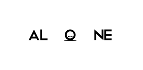
- The typographical poster above looks visually strong in terms of how the typography is forming a visual sense of the word ”alone”.
- The negative space is playing a significant role in terms of making the viewer focus straight on the word.
- The elimination of the letter “e” from the other words and placing the letter outside of the black background with opposite colour making it look distinctive and forming a sense of being separated and falling apart.
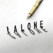
- Adding gaps in between each letter with addition of a lonely man walking on the opposite side from the words straight away visually engage the viewer with the word.
- Drawing of the word in 3d form with the addition of shadow is making the typography well-defined and prominent.
- The use of black colour for the entire typography is automatically making the viewer feel the emotion of darkness.
- Long gap used in between the letters directly making the viewer feel left alone.
- The technique of adding a long space in between is a clever idea to visually engage the viewer with the word.
- White background is used in the form of positive space with black colour typography to make the word look visually alone and stand out.
SOUND RESEARCH:
ANALYSIS:
The music used at the very start of the clip is the sound effect used to create suspense and tension, they are not made by Foley but these are the sound effect they have added to the clip to create such stress and tension among the audience not only by visual but also the sound effects, the cat screaming and horses sound are the original voices of the animals they have used inside the clip, the sound effect of the water movement is made by Foley, and then nearly in the last of the clip, they have used the suspense breaking and more tension creating sound effect as something is just going to happen, and then suddenly the sound effect of monster gurgling start with the background sound effect playing as well, the grudge gurgling sound has been made originally by Foley, the director of the movie created such scary sound, which is actually feeling like real sound effect, and in the last scene again sound effects of tension and curiosity has been used to create strong sound effects.
ANALYSIS:
The sound effect of light saber is made by the sound designer Ben Burt, who created the sound by the blend of television buzzing along with the old projector sound combined together to create the original sound, a cardioid mic without the windscreen is used to pick up the electrical interference, dimmer switch has been used to allow more control to what type of sound to add, the sound designer slowly moved the mic in a circular pattern to create variation. He combined both the buzz and hum sound together to create the final amazing light saber sound effect.
ANALYSIS:
Eastenders is one of the most watched television programme. Although this serial have got popularity over all type of audiences but the mostly people includes the Middle aged people as I got reviews from different people but the mostly I found are the middle aged. the opening sequence of the serial followed by blue, green and grey map has been given. a face-lift and brought into the 21st century, with a new three- dimensional coloured map, complete with a Thames boat and moving clouds. As compared to the old version aside in 1985, the new version has stronger drum beats and various percussion instruments laying in the background. The execution has changed a few times with different colours and treatments of aerial photos, the concept hasn’t changed since the time it was first produced in 1985. The composition of the theme includes the piano, bass, drums various different keyboard samples, real strings, the whistle.
DIEGETIC SOUND:
In this clip, there is lot of diegetic and sounds have been used, at the beginning we can hear lots of distant background noises as spooked horses and distant screaming of a woman, along with the natural sounds such as heavy rain and footsteps coming towards the character. The heavy rain here is making the connection of the mood of the character with the scene like generally the heavy rain is a sign of scariness, the loud voices of the water falling so here the fear is connecting to the character because he is afraid and feeling scared. The natural sound used creates realism to the scene and immerse the viewers more into the story, the protagonist heavy breathing is a pleonastic sound that gives a massive impact on the audience as they can feel his fear for what will happen next and gives the same feeling as the character is feeling that time.
NON-DIEGETIC SOUND:
In this scene, there is very little non-diegetic sound used. in this movie the majority of the clips are diegetic as to add familiarity and realism. In this scene the non diegetic sound used is in the form of quiet instrumental string music, which is mainly one note, but this sound really creates tension and makes the audience feel uncomfortable from the sound going on in the background as what will happen next.
SOUND EFFECTS:
Loud noises and screams happen frequently, often as if from nowhere, the sudden loud noises enhance the experience for both the characters and audience. Slamming doors is a repeated theme, along with the sound of the rocking chair. The director uses the sound to build up throughout a scene, getting louder towards a climax. In most scenes, the audience are aware that the sound has something to do with the Woman, Echoes and reverb makes the sound louder than natural, The sound leads much of the action, and is used to create different atmospheres, such as the village pub or the horse and cart. Sound is used to both scare and create atmosphere, adding to the overall effectiveness of the play.
ANALYSIS:
The opening theme of the movie is quiet like the bells ringing rhythm, as the music is going forward, the echoes are getting louder and louder to create the feel of scariness, The silence after the ringing bells allows the audience to relax a bit bus as the music is going forward, then sound effects are getting louder and strong which is creating an impact of tension, scary feel, the noises getting louder making the audience more uncomfortable and getting them more in depth with the movie as what will happen next.
MY BRIEF:
- The brief is to create a title sequence of drama “Alone”.
- The video have to around 1 minute long maximum.
- The genre of the title sequence is ‘horror’ and ‘suspense’.
- There are no limitations and restrictions in terms of design, colour and story line which gives me an opportunity to try every thing possible and decide the best in the final.
- The theme of the video have to be dark in terms to target the genre which is horror and suspense.
- The sound effects have to abstracted and sound scary to make the audience connected to the content and not to find out the detailed story.
- The title sequence have to withhold the actual story by adding suspense and keeping the sounds quite abstract.
TARGET AUDIENCE:
The target audience for this project will be young adults and teenagers. The usual age for the target audience of my horror title sequence is from 15 to 25. The most common reason for this is that young adults and teenagers enjoy thrills. These thrills are more likely to excite a younger audience rather than an older audience.
My title sequence would also aim at individuals that enjoy a sense of mystery, suspense and illusion as I said in the brief, the title sequence will be withholding the story to keep the audience excited and add a sense of mystery and suspense along with the horror theme.
IDEAS GENERATION:


SELF REFLECTION ON INITIAL IDEAS:
- The above images are showing the initial ideas for the title sequence “Alone”.
- All the ideas have got potential and strong story line as I have selected a specific genre which is “horror” to create my title sequence on.
- I will choose couple of them to create a detailed version of story boards to select the final one from the further developed storyboards.
DETAILED STORYBOARD VERSIONS:
idea #1:

REFLECTION:
The idea #1 is primarily based on the evolving of hands over a black background holding gap in between and there will be a time where all the hands will appear on the screen that one can barely see the background, the hands will then start to disappear one by one accompanying with horror and suspense sound effect revealing the word “Alone” on the screen.
idea#2:

REFLECTION:
The idea#2 is similar to a thrilling and suspense teaser because its purely based on video shooting and locations. The video will start showing a wide shot of the whole location which have to a forest or a glen, a girl will then walk from the side of the screen who is going to sit on the bench somewhere. Only the back side of the girl will be revealed to the audience, suddenly the camera will move backwards revealing the smoke coming and it will them move to the left and right side, zooming on the trees or plants to show the appearance of the hands from in between the trees. Camera will show a wide shot to show the proper view of hands from both sides coming out. Suddenly the camera will start moving forward making the subject closer ans closer and the girl will turn back and the screen will go black with horror or a shouting sound effect revealing the word “Alone”in the end.
idea#3:

REFLECTION:
The idea#3 is also similar to a short movie film teaser. The camera will show the wide shot of the whole scene from the centre and them move from the centre to left and from the left to the right side. A person will start walking from the left side and will keep walking to the path way or a road. The camera will then show a wide shot showing the person in the middle of the path far away from the camera. Suddenly weird sounds will start to appear and the person will stop. The audience will be able to see a ghost or creepy eyes behind the trees/dark. At that point the smoke will start appearing from the bottom of the screen revealing the word “Alone” and the screen will go black ending the video with the shouting of the person.
SELF-REFLECTION ON DETAILED STORYBOARD VERSIONS OF IDEAS:
- The above images are showing the 3 ideas that I have created detailed storyboards to get an idea of different elements, design principles and objects that I will be using and which idea will work best depending on the sources I have and can use which I can control.
- Idea #2 and 3 are purely video teasers using cameras and locations mainly and editing afterwards that which I feel will be purely digital media as according to the brief and the course requirements we are supposed to experiment both the digital media along with physical /3d work.
- In the idea#1, involvement of physical objects is present, along with video shoot and combining both the digital and mixed media together to develop the final title sequence.
- Considering the brief and the course I feel idea#1 will allow me to experiment both the mixed media/ physical and digital media together and the result will be the mix of both physical and digital work.
DETAILED VERSIONS OF STORYBOARD FOR FINAL IDEA:

EXPERIMENTATION :
CUTTING WORD ALONE USING LASER CUTTER:

1 
2 
3 
4 
5 
6 
7 
8 
9
I have used laser cutter to cut the word “Alone” on wood, I experimented with two different font styles for the word and I will save the cut out words to see how I can use them inside the video.
introduction to DSLR cameras:
DEPTH OF FIELD:
Depth of field is the distance between the closest and farthest objects in a photo that appears acceptably sharp. Depth of field is controlled by changing the aperture setting on the camera. Like our eye, a camera lens has an iris inside that can open or close to let in more or less light. We have control the size of this hole, or aperture, by changing the aperture setting, which is measured using a scale of f-stops.
Below images are showing some experimentation adjusting the f-stop and aperture to apply depth of field.


LIGHT EXPERIMENTS IN STUDIO:
We had a session with Andy in studio experimenting different light techniques to use while using studio and dark space.

cof 
edf 
ozedf 
ozedf 
ozedf 
oznor 
edf 
oznor 
oznor 
oznor 
oznor 
oznor
•In tutorial session with Andy, we were introduced to the studio settings and how to control and create lighting according to the need.
•As a prop, we have used type writer and experimented different light settings using DSLR cameras.
IDEA EXPERIMENTATION USING DIFFERENT SHEETS:

dav 
dav 
dav 
dav 
btr
REFLECTION:
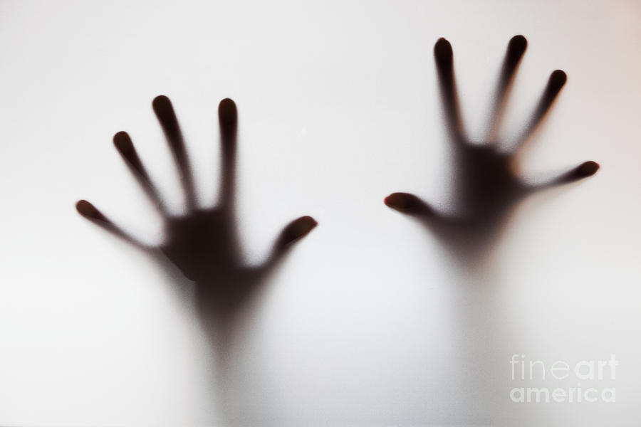
- To get the desired shadow of the hands, I experimented using different plastic sheets of different colours.
- I feel the coloured plastic sheets did not worked because of the colour, and there was not a foggy shadow which I was looking for.
- I also used tracing paper sheet, as the sheet was similar to sand paper texture and not smooth, I found the perfect shadow when I placed the hands in the back of the paper which can be seen in the last two images.
- I edited the photo of my hand over the sheet in black and white filter which I feel will be suitable because the theme and genre of the title sequence is ‘horror’, the dark colours will be best to use.
EXPERIMENTATION WITH LIGHTING AND SETTING UP TO CREATE THE BACKGROUND:

cof 
dav 
cof 
dav 
cof 
dav
- To create the background for the video, I used two easels to hold the tracing paper sheet in between by sticking the sides of the sheet to both sides of the easel using masking tape.
- To create the perfect lighting, I used light boxes and experimented different lighting conditions by placing the lights on various places on the backside.
- As I wanted to create a foggy look background so when the hands will come on the screen they will leave a shadow which can be seen in the experimentation with different sheets in the above post.
- I turned off all the room lights and by using the lighting boxes, I tried to adjust the lighting until I got a shadowy background, dark from the sides and light reflection in the centre.
EXPERIMENTATION WITH HANDS OVER THE BACKGROUND:

sdr 
sdr 
dav 
sdr 
sdr
REFLECTION:
- After the setup of the background, I asked different class mates to move their hand from the back of the sheet.
- I have experimented all different types of shadows I was getting from all different movements of the hands.
- Also it was quite hard to adjust the lighting because as the hand was moving, the light in the background was not steady and was continuously changing as the hands were moving.
- Also I found out that the normal hands are not delivering that horror feel as the normal hands I used were looking soft and delicate and I want to make the audience to feel a sense of horror and terror.
EVALUATION ON THE EXPERIMENTATION:
- I would say that experimentation at each step helps me to understand the things which are working and which things are not working and needs adjusting or changing.
- Experimentation with creating the actual background by the help of easels and tracing paper to create the background was quite helpful at that point to experiment as it gives me a clear idea of which things are not working and needs to change.
- I feel that I found it quite hard to adjust the lighting and keep the light same and stable through out because when there was a little movement, the background light was also changing which I feel is not suitable as the background have to the same on which the hands hands have to move.
- The hands movement experiment was also helpful in terms of observing the things which are not working as I planned. The normal hands were quite soft and because of that fact I feel these hands are not giving or delivering any sense of horror.
- All the experimentation were quite helpful to understand the things which are not working and the drawbacks of various elements which needs adjusting and changing such as hands and the continuous movement of the background whenever there was a slight hand movement.
EXPERIMENTATION USING ADOBE PREMIERE PRO:


- After experimenting with light settings and hands moving filming, I tried to edit the parts together using Adobe Premiere Pro.
- As I mentioned in the above evaluation that the light was hard to get controlled when the hands were moving, but I still tried to edit parts of the video and then add transform effect to make the hand move at least over the background but the light was moving continuously which was not looking suitable.
- After trying all different techniques and skills to make the footage work somehow, I got an idea to use the same background that I wanted and also had the footage of the background, I kept the background same and used a transparent ghost hand to experiment using the storyboard.
- After placing the shadowy background, the one problem was solved which was the movement of the lighting in the background, because of using the same background footage in the back, the background was no more light movements.
- I used a scary hand transparent file and by adding “transform effect”, I was able to change the size of the hand at every point.
- By using transform effect and animation, I managed to make the scary hand move from all different directions of the screen same as I planned in the storyboard.
REFLECTION:
- It was beneficial to experiment with the footage I got using Premiere Pro to get a clear view of which things are working and which things are not working and needs to be change.
- During the experiment, I got an idea of using the footage of the background which solved the main issue of the light movement.
- I feel it will be useful if I will not use the real hands because it will be quite hard to make them move from all different directions over the shadowy background.
- I feel experimentation at this point really helped me in making clear decision by considering what actually worked best and which things needs to be worked on or replaced.
FURTHER RESEARCH:
ANALYSIS:
ANALYSIS:
The title sequence above is created by a media student that I found on YouTube. The title sequence looks horrifying and scary just the way everything has been done marvelously. I really like the sound effects used in between the text appearance and the way the text colours are overlapping. Trees landscapes have been used as a background for the sequence in black and white mode. I feel every which has been included in the video is perfectly worked and definitely keeping the audience connected to the content. Although the video is not actually filmed not even a single clip has been used but I am inspire the way, images are used as a main and strong element along with visual effects been added to the images to deliver exactly the same feel as the audience expect from a video based title sequence.
ANALYSIS:
The title sequence above is an example of horror title sequence created by use of images. I like how the images are used to develop title sequence rather than actual filming the scenes. The visual effects used are old and rough, and really like the fact, photograph effect used to convey the same concept to the audience in the form of camera clicks and the way images are moving further revealing a new image. The sound effects are mix up of suspense, thrilling sounds along with scary sounds in between making the audience feel the negativity and horror.
CHANGES MADE:
- After experimenting with all the above work in Adobe Premiere pro, I felt that this hands idea was not working well as I was expecting because it was only hands moving and going back and to me, it is not looking scary and it is also hard to add the typography in between the hands.
- After going back to further research into horror title sequence, I found some more ideas to experiment and include into this project such as using images of horror places and things and add effects to make the video.
IDEAS FROM FURTHER RESEARCH:
- Researching further at a point where I was out of ideas and confused, it was a great help which I got from researching more in depth into horror title sequences from variety of different platforms.
- Most of the title sequences which I researched included images and by the use of animation and visual effects along with horror sound effects. I feel I quite like the concept of using images of unusual things and quiet places to create a horror title sequence.
- As I quite like the ideas of gathering images together and applying visual effects and editing to make an horror title sequence, I am going to take this inspiration and experiment further ideas to explore more innovative work.
ACTUAL PHOTOGRAPHS (WITHOUT EDITING):
ADDING HORROR EFFECTS TO IMAGES:
- From my photographs collection, I used some of the images including images of quiet places, old buildings and my own mark making.
- I have used ‘Pics art’ photo editing application in my mobile and used black and white HDR effect with old paper texture filter which turned the images into an horror and dark themed pictures which was exactly the effect I wanted to use.


EDITING IN ADOBE AFTER EFFECTS:
- After the images editing, I used Adobe After effects to start adding the animation and visual effects to the images.
- I researched for different types of visual effects that I can add to the images, I also watched and followed editing tutorials to learn different effects.
- While I was researching into visual effects, I came across a quite scary and effective smoke effect which will work perfectly with the horror theme and learn how to add the effect by following the tutorial on YouTube.
- By following the tutorial, I applied the smoke effect to all images which I feel set an horror ad dark feel, the way images were appearing one by one.
- I have also edited each layer individually by managing the time on each layer and how long the images have to stay on the screen.


EDITING IN ADOBE PREMIERE PRO:
- I downloaded first edited version from After Effects and imported the file into Adobe Premiere Pro to do more editing.
- As I wanted to show the name “Alone” at the end point, and to reveal the name I was looking for quite innovative and sophisticated typography and an idea to reveal the name.
- I used the same scary hand which I have used in the first version and in Photoshop applied different textures to make the hand look creepy and scary.
- In Adobe Premiere Pro, imported the hand png transparent file and applied animation and transform effects to adjust the scale and position.
- I experimented applying different layer effects to see which will look best and by experimenting all different layer effect, I feel overlay effect was working best as this effect was merging the two layers together making the hand textures look strong and not fully visible at the same time.


ADDING SOUND EFFECTS USING PREMIERE PRO:
- To add the sound effects, I used Adobe Premiere Pro to edit and merge different sound effects in the video.
- I did research into different sound effects as the video genre is horror and suspense so I had to find the sound effects according to the genre.
- I search different royalty free websites and downloaded some of the sound effects from one of the website and imported all different sound effects in Premiere Pro.
- In Adobe Premiere Pro, I have merged, cut and applied slow and fast speed effects to make the sound effects abstract to keep the audience connected to the content and not to figure out the story by listening to the sounds and this is the reason I have used quite abstract voices and suspense sounds and merged different parts together.
FORMATIVE ASSESSMENT FEEDBACK:
- I had a formative assessment with Kathryn, which was immensely helpful in terms of getting a clear report in depth of all the work I have been doing for this module from the starting until now.
- I feel, the feedback helped me in understanding what things I need to improve and how work has been counted towards the final grades.
- Kathryn mentioned me to remove some of the images and sound effects and also she quite like the first version that I created using scary hands and suggested me to add that video in place of a single scary hand that I have added in the last part of the video.
ACTION PLAN FOR FEEDBACK:
- I feel the feedback was hugely supportive as the feedback was clear to understand the progress level I was on and what things needs improving and changing at this stage.
- I found that the suggestion I received was really helpful and beneficial at this stage.
- The feedback also worked as a critical feedback from a second person,which was helpful to get other opinions about the work I was creating.
- I will definitely experiment the first version of hands video in place of the hand I added in the end part as I also feel instead of having one scary hand, it would make the content look more scary and different hands coming out will also look better with the trees background imagery in the background.
PEER FEEDBACK:
- The video looks amazing and the visual effects used are really cool.
- I feel the video is definitely targeting the specific audience which are young adults as I am an adult and definitely felt the aspect of horror and suspense in this title sequence.
- I just loved the title sequence because it is definitely setting up the mood for the audience to get ready for a proper horror and mysterious movie.
- The visual effects are mind blowing and unique, love the sound effects, they are abstract and not letting the audience guess the story-line.
- The only thing I would suggest that may be try to experiment old hand version in place of a single hand as that version looks really cool and would make the ending proper scary with all the hands coming to the screen rather than one single hand.
CHANGES ADDED:
- I have made few changes according to the feedback I received before in my formative assessment and I also feel that the suggestions I received were quite helpful for the project.
- In Adobe Premiere Pro, I saved the first version of hands as a mp4 file and imported the file into the recent video replacing the single hand file at the end of the video.
- I have again experimented different layer effects to add to the hand moving version file and this time I selected ‘light burn’ effect as this effect was merging both the layers (hands and trees image) perfectly and not fully visible.
- I also removed some of the sound effects after getting few feedback and edited the sound according to the need of the theme which was horror and suspense, leaving the audience to guess the story line.


FINAL VIDEO:
EVALUATION:
- For this project, I feel I have worked hard and efficiently throughout the whole project. I have dedicated the right amount of time and massive effort for this project.
- I have gathered a massive amount of research including 3d and expressive typography, historical and contemporary title sequences, colour psychology and various tutorials to create horror and mysterious effects.
- I feel researching part really aided me in terms of understanding the horror genre in depth and the elements which are important to be considered.
- By analysing the work of others in the form of research, it allows me to think critically in terms of which design elements are good and have worked good and which elements have not worked well from my point of view and provided me with a wide and broad idea of the things and elements to use and avoid for my project.
- It was an advantage that we must create our own brief after the project brief was launched which only provided us with the name of the title sequence “Alone” that we must use.
- As I created my own brief, it allows me with the opportunity to explore and experiment things broadly without any restrictions in terms of time, genre, typography and storyline.
- Throughout this project, I have developed and applied various effects which helped me to grow as an individual and as a designer. Skills such as editing and applying various effects using Adobe Premiere pro and After Effects. I have learned different effects by following tutorials on YouTube.
- All the work I have done so far in this project was immensely helpful and I have learned a lot in terms of working according to my own brief and how and when to take decisions which were important at that time.
- I feel that I have made decisions which were right for my project at certain points which can be found on my blog and being reflective and analytical with my own works makes me more confident to face the good and bad comments from the peers and make decisions which I feel were best for my project.
- I feel I have struggled at various points such as adding a specific effect to the hands in the last part and to take the decision of exploring the second idea of adding images and then merging the main idea and the new one together.
- I would say that I have been organised with time management which helped me in working according to the time plan and completing the project in a specific time frame.
- I feel I have achieved my target as I have set in my own brief, all the work has been done and completed from the research to the final production including the time management, highlighting the changes which occurred, decision made at several points during the project and analysing and evaluating my own work at each stage.
- I would say through this project I have gain different skills and it makes me more confident, enthusiastic and experimental with my own work and the project worked as an independent project where I have to set my own brief, which helped me to work and judge at the same time.
- I am glad that the final title sequence for “Alone” is targeting the specific audience that is young adults including the age between 15-25 after receiving positive feedback from peers and other people of the same age group that I wanted to target through my project because I feel I had make sure that I am using such elements including mystery, suspense, abstract sound effects and scary effects which all together create an horror title sequence.
- If I will get a chance again sometime in future to work on this project or relevant, I would try to experiment with filming and real video footage along with exploring new visual effects and creative cinematography techniques.
