RESEARCH:


Guilherme Vissotto:
Guilherme Vissotto is a brand designer and Art director from Brazil. I found his work on Behance and quite love the way he play around with colour in his work.
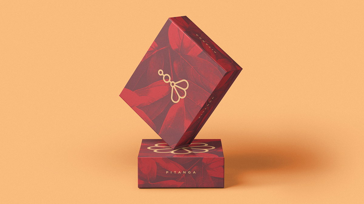
- The colour combination and the main palette used is making the brand standout.
- The logo design is minimal but giving a feeling of strength and strong.
- The composition is pleasing and elegant.
LAURA MENTA:
Laura Menta is a graphic designer from Mexico. Menta is also the name of her graphic design studio that celebrates simplicity with a sip of nostalgia and specialises in Branding and packaging, founded in 2008, Menta looks for inspiration in past decades and present times, to create meaningful brand identities that balance classic & contemporary aesthetics.


- The work above straight away gives that feel of natural and organic ingredients because of the simple colour used with minimal design.
- The presentation is amazing and helping each item stand out in a clean and soft background.
- There is a limited colour palette used which is one of the important part that I feel making the brand simple and clean.
- Very subtle, elegant and sophisticated.
Kati Forner:
Kati is a Los Angeles based designer with over 12 years of experience in print, digital design and production. Kati began her professional career in Chicago, working with several innovative design agencies. Five years ago, she brought her creative studio to Los Angeles, where they’ve developed comprehensive identities for beauty, fashion and lifestyle brands.


- I like how it has an elegant and clean look while being well organised.
- Beautiful presentation making the logo design and typography stand out over clean background.
- Minimal and elegant design.
- I really like how simple is the logo and the way colours are used in the background making the brand name stand out.
Hany Alattar:
Hany Alattar is a graphic designer and specialises in graphic design and Branding from Alexandria, Egypt.


- The logo design is cute and elegant and I feel that’s what you feel when people see pets.
- I am attracted to the colours used in the logo design which I feel is making the logo design cool.
- I am really inspired by the creative process behind this logo design, using P from the word ‘pet’ and its just amazing how the faces been created by P alphabet and surely connecting the logo with pets.
Mustafa Akülker:
Mustafa Akülker is co-founder and design director of Marka Network. Marka Network is an award-winning branding agency specialised in Branding and Packaging. He work with Brands and Start-Ups worldwide and offer unique branding experiences for brands and companies.


- The colours are making the product and branding beautiful because the pastel colour making it look simple and elegant.
- The brand is conveying a sense of freshness and natural feel.
- I like the simplicity and the colours combined to brings the full essence of the work.
- The illustrations and the colour palette used are elegant and simple, helping the viewer to see different flavours and provides a feel of refreshment.
- I like the colour scheme because it is calming, elegant and clean layout.
BRIEF:
- For the module Ar4702, I decided to explore packaging design and my brief is to create a packaging design for jewellery and to show diversity in the form of different classes such as luxury, homemade, affordable etc.
FURTHER RESEARCH:

- The packaging design above is handmade which can be seen by the look of boxes.
- The typography used is calligraphic handmade type which is making the brand give the feeling of nature and handmade work.
- The flowers used in the design straight away connecting the speciality which is natural flowers based jewellery with the packaging design.
- The overall design looks clean and colourful and highlighting the brand beautifully in the form of handmade typography and flowers used.
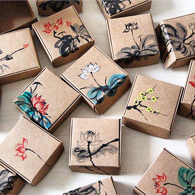
- The packaging design above gives a feeling of handmade straight after you look at the boxes.
- The boxes are also handmade and there is a different painting which can be seen on each packaging box, making the design look simple and traditional in some ways such as the colour of boxes and the handmade painting techniques used.
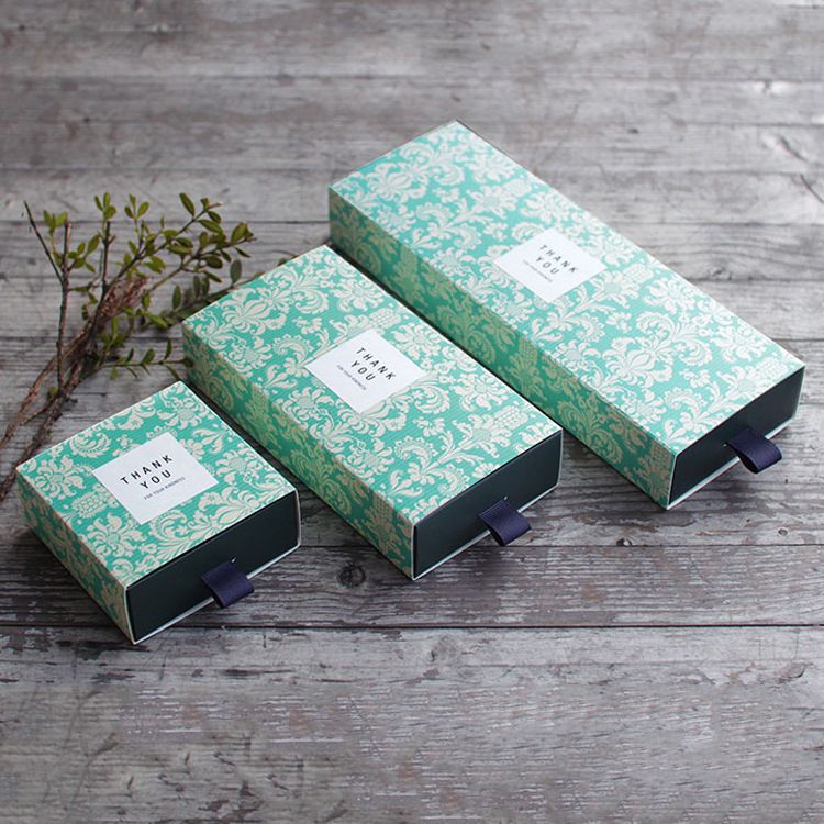
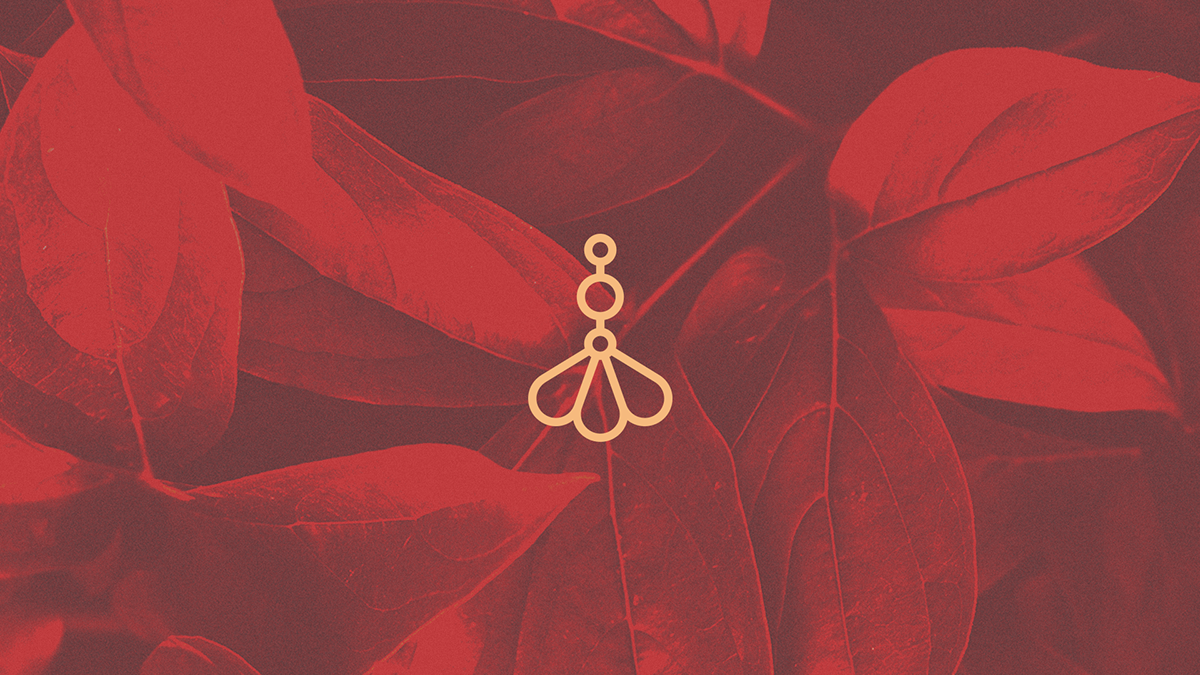
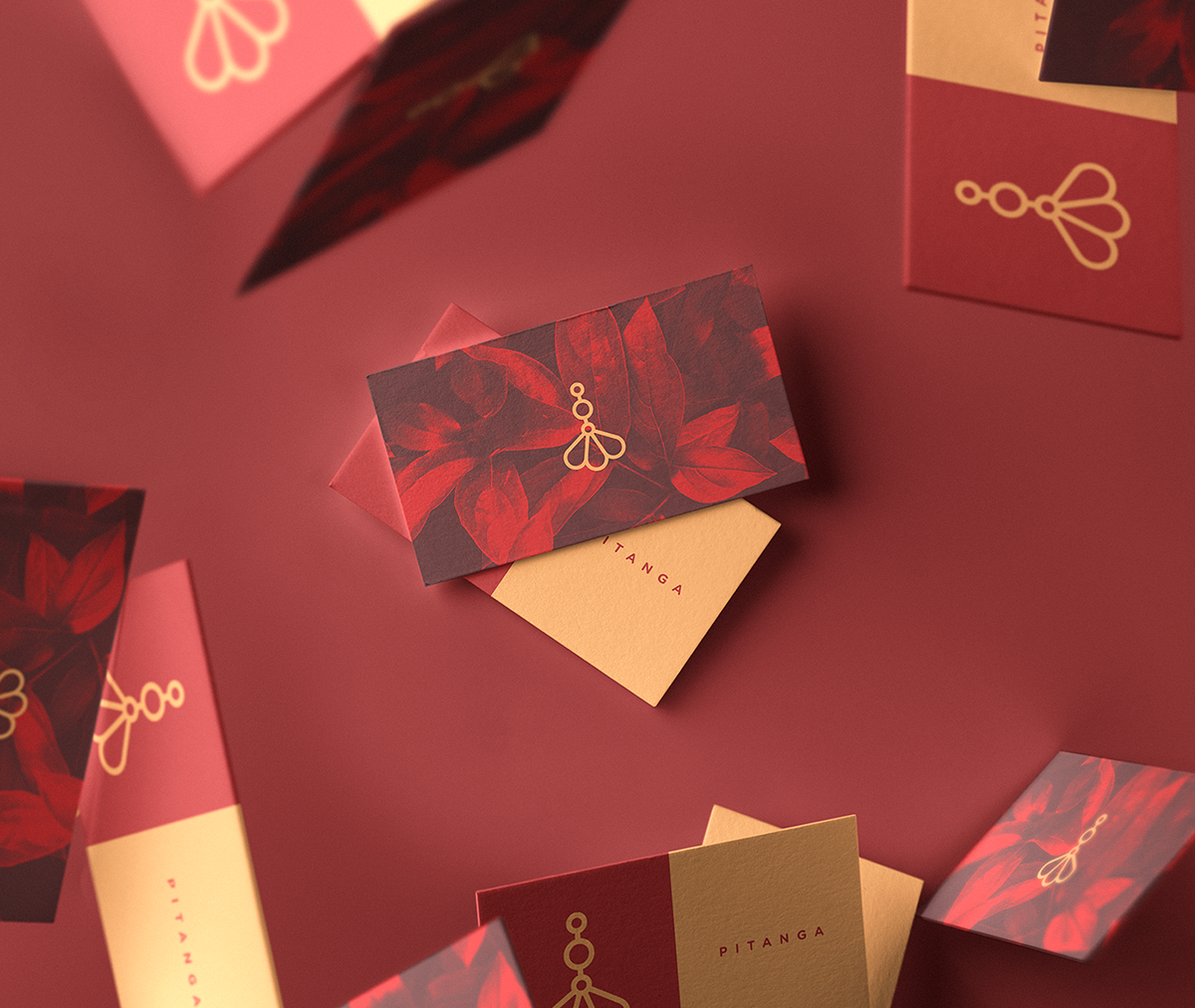
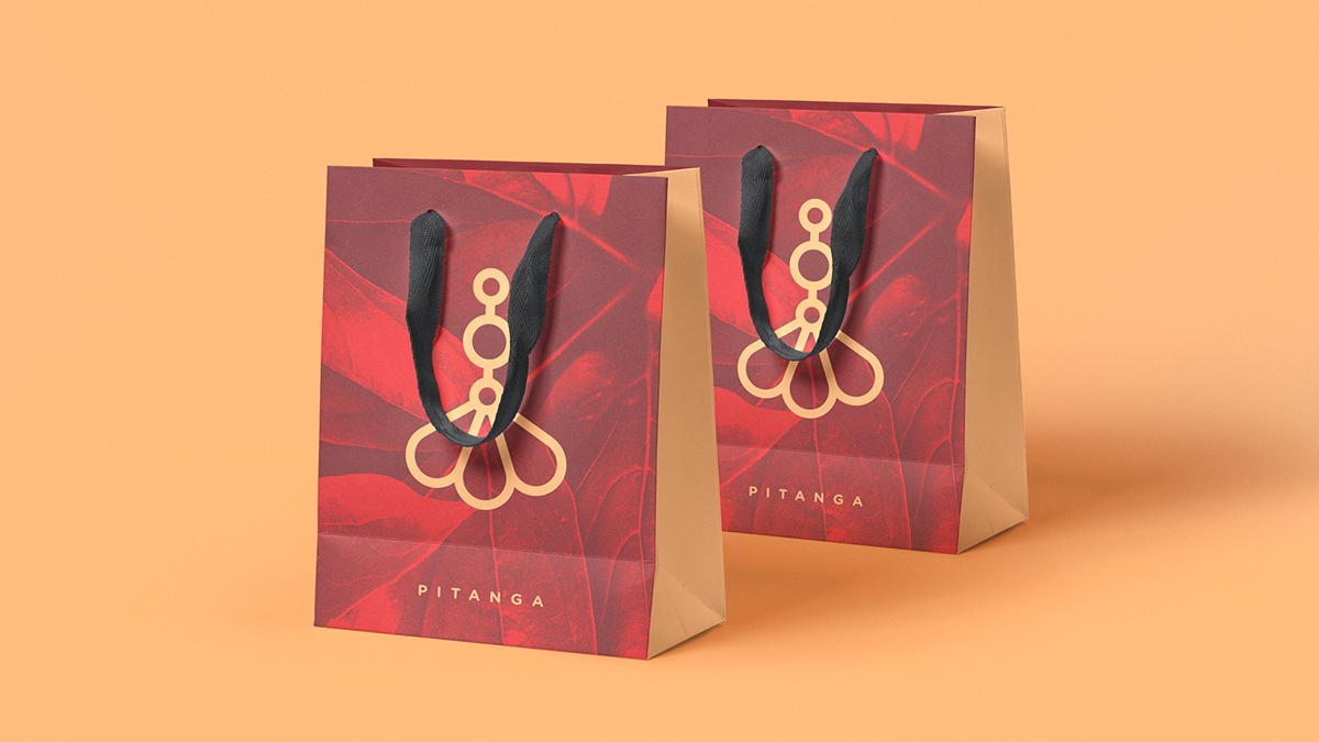
- The packaging above looks interesting in terms of its design and layout.
- The design looks sophisticated and clean although there is not much blank space present.
- The colours used are complimenting each other really well and there is limited colour palette used which I would say is making the packaging looks clean and modern.
- There is one pattern used for the whole packaging design which I think give the design natural look somehow.

REFLECTION:
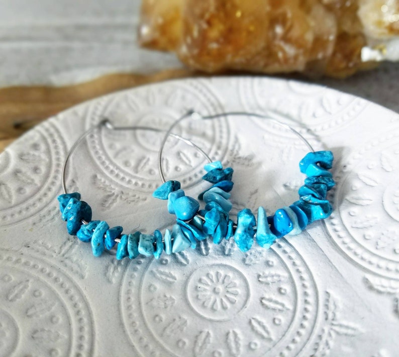
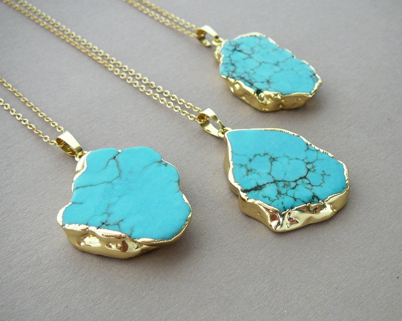
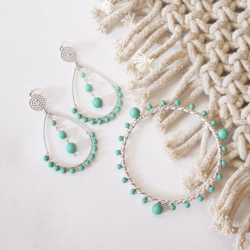
- I have researched into hand made turquoise jewellery online to see different types of turquoise jewellery.
- As I wanted to do packaging design for turquoise jewellery, it was important for me to know different designers and people creating this jewellery and selling online.
- I might use one of the jewellery maker name and can do packaging design for them or I can do my own brand from scratch and start working from the beginning till the end on that brand.
BRAND ETHOS:
- Natural
- Sophisticated
- Professional
- Clean
BRAND (FEROZA):
After doing loads of research into jewellery packaging and design, I decided to choose turquoise jewellery to do the packaging for. To make the brand unique, I used the name ‘feroza’, which means sky blue colour in Urdu language and as I am from Pakistan and in Pakistan as well as in Muslim religion, different stones are used as a form of safety if you wear specific stone and the turquoise stone is one of the famous stones to have healing powers and spirituality.


COLOUR SCHEME:

REFLECTION:
- After doing research into the nature of the turquoise stone, I created a colour scheme for the brand which I might use later on into the packaging design.
- I have chosen a natural colours and used the colours which are mostly present in the turquoise stones as can be seen above in the photograph where I used turquoise stone picture and created the colour palette from the the different shades and colours which were present in the stones.
TYPOGRAPHY:


REFLECTION:
- I have experimented different hand drawn and digital fonts to use for the brand ‘feroza’ as I feel the word itself have to give the feeling of natural stone to the viewers.
PATTERN:


REFLECTION:
- I experimented different patterns which I feel are quite unusual because I wanted to create patterns which are natural and not perfect in terms of shape.
- I tried to draw different patterns in the form of curvy lines, dots, waves etc to keep the patterns unique and close to nature.
EXPERIMENTING WITH IDEAS:


FURTHER EXPERIMENTATION


